
Project Overview
Lea English is an online learning platform created by Léa, a professional multilingual language coach who speaks five languages fluently. She has built a community of over 350,000 French-speaking learners. Her teaching approach emphasizes effective learning of everyday English through practical conversational skills.
Unlike traditional grammar-focused courses or excessively gamified apps, her minimalist approach prioritizes essential speaking skills and natural language use. The goal is to achieve quick, real-world fluency.
With a proven web application and feedback from her paying users, Léa partnered with our team. This collaboration enabled us to evolve this learning experience through a thoughtfully designed mobile app centered on user needs.
The Challenge / Context
Language learners often face overloaded, grammar-heavy programs that limit their conversational progress. Other methods, conversely, rely too heavily on gamification at the expense of effectiveness.
Traditional apps generally target beginners, without truly enabling an effective transition to intermediate or advanced levels.
Furthermore, learners frequently lack practice in real conversations and face difficulties communicating confidently in real-life situations.
Our Role - BearStudio
Product Designer (UI/UX Designer), responsible for:
-
User research (expert interviews, usability feedback, competitive analysis)
-
Information architecture and user journeys
-
Wireframing and prototyping
-
Usability testing and design iterations
-
Iterative collaboration with developers on technical challenges and idea feasibility
Developers:
-
Development of the app in React Native / Expo, for deployment on Android and iOS
-
Design of animations to enhance the app experience
-
Implementation of the conversational bot feature (based on OpenAI’s API)
-
Integration of feedback from the product designer and Léa
-
Use of shared components from Storybook and Figma to ensure consistency and efficiency in the interface
Research & Key Insights
Kickoff Workshop
To fully leverage our client’s deep knowledge of her users, we held a focused 3-hour collaborative workshop with Léa. She shared extensive feedback collected directly from her users. This data is rich and qualitative. It comes from Léa’s field experience and her direct interactions with over 350,000 engaged learners. Thanks to this information, we were able to quickly identify key user needs. It also helped validate the main pain points encountered. We sketched initial ideas in real time, as insights emerged, nourished by Léa’s invaluable teaching experience.
General sketch from our online workshop with the client
We complemented these valuable client-provided insights with a targeted competitive analysis (studying platforms like Duolingo, iTalki, and Simpler). This allowed us to identify specific UX best practices and areas for improvement. This approach helped us strengthen the solid foundations laid by Léa. We combined her user-centered feedback with industry standards. Thanks to this, we were able to clearly define a strong direction for our design work.
Additional Details on Initial Data and Research
Competitive Analysis
To better understand the market, we studied several platforms such as Duolingo (excellent gamification, but limited speaking practice), iTalki (live tutors, but scheduling and lesson content that can feel fragmented), and Simpler (primarily targeting beginners through a grammar-based approach, which doesn’t deliver fast results in everyday communication).
From this competitive analysis, it became clear that the app to be designed needed to demonstrate effectiveness by emulating our client’s teaching method and improving real-time feedback. Since private lessons are often expensive or inflexible, our goal was to create an integrated solution combining the best of both worlds: interactive online lessons and on-demand exercises, while maintaining an engaging yet results-oriented format.
User Feedback on the First Version of the Web App
Over 400 learners participated in feedback through surveys, revealing several pain points:
-
Missing features - Users made clear suggestions to improve their learning routine on the existing app.
-
Motivation and consistency - Many struggled to stay consistent without concrete progress indicators and notification features.
Our in-depth analysis of the web app, cross-referenced with feedback from regular paying users, highlighted several friction points:
-
High cognitive load, making usage sometimes tiring or discouraging.
-
Lack of fluidity in user journeys, undermining the overall experience.
-
Usability issues, with key interactions deemed unintuitive or unnecessarily complex.
These obstacles significantly reduced engagement and accessibility. Beyond UX issues, we also identified technical flaws, including security vulnerabilities and recurring functional bugs.
Some of Our Observations
-
Excessive clicks in tests - Users had to chain multiple clicks to move to the next step, adding unnecessary delays and harming the flow of the experience.
-
Asynchronous audio experience - The transcription did not highlight words in real time during playback, making it difficult for users to follow along.
-
Limited flash card interaction - The flip mechanism was unintuitive and did not support a smooth, continuous learning experience.
Target Audience
-
Adult learners ranging from complete beginners (A1) to advanced (C1).
-
Users who prefer practical, effective learning rather than grammar-focused approaches.
-
People looking to develop their speaking confidence through regular, interactive, conversation-oriented practice.
We ensured that design decisions were aligned with real user needs. By mapping user behaviors, goals, and frustrations, the research provided a better understanding of the first version’s limitations. These limitations mainly concerned usability and the ability to sustain user engagement. Furthermore, this analysis served as a reference throughout the design process. It helped prioritize the necessary improvements. These aimed to enrich the overall experience, streamline interactions, and increase user satisfaction.
Clear Approach: Guiding Principles and Benefits
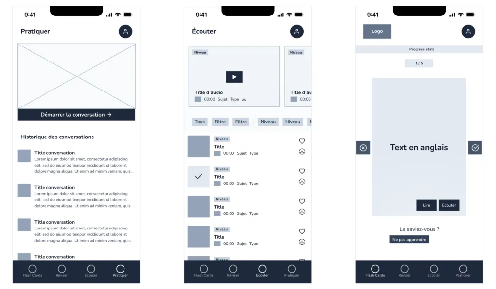
Seamless Integration to Reinforce Learning
Vocabulary, audio, and interactive exercises are tightly connected, creating a cohesive ecosystem. Users naturally reinforce their skills through varied and interconnected interactions, promoting effective memorization and assimilation.
Personalized Learning Experience
By leveraging the user’s level, preferences, and behaviors, the app consistently delivers tailored content and interactions, significantly boosting motivation and learning effectiveness. This leads to user-centered personalization.
Intuitive and Engaging UX
Prioritizing simple, clear, and intuitive interactions ensures minimal cognitive load, allowing users to focus fully on language learning rather than navigation. The integration of gamified interactions, daily limits, clear progress indicators, and immediate feedback motivates users to maintain regular language practice. This leads to continuous learning motivation.
A Flexible Approach Accessible to All Levels
While addressing a broad audience, the app allows users to choose their learning type while following a defined progression to reach the next level. This leads to sustained platform engagement.
Design & Iteration
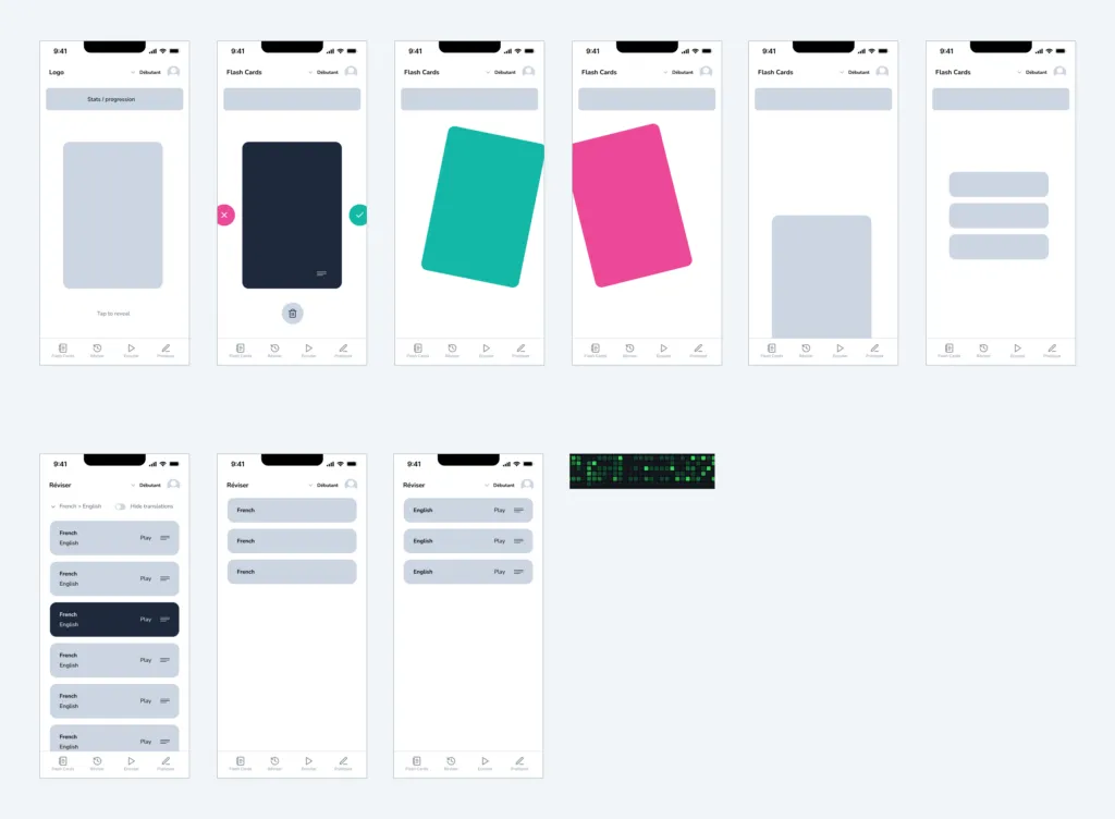
Initial Wireframes
We used wireframes to define the app’s features and structure its main sections as well as its information architecture.
-
Interactive Cards - a short test to ensure the gesture was intuitive for users from the start.
-
Audio Listening - testing quick access to audio levels desired by the user.
-
AI Chat - testing clarity of distinction for users between the daily interactive conversation and past conversations, which needed to be clearly indicated as inactive.
Usability Testing and Validation
We conducted internal usability testing sessions with six colleagues. These tests were based on low-fidelity wireframes. We focused on task-based scenarios. The goal was to quickly evaluate the clarity of interactions, navigation intuitiveness, and overall engagement. This feedback fueled rapid design iterations.
One of the adjustments concerned card behavior, with the addition of a “Don’t learn” button, requested by users for cases where they no longer wanted to practice a word or expression.
Design Explained
Branding and Design System
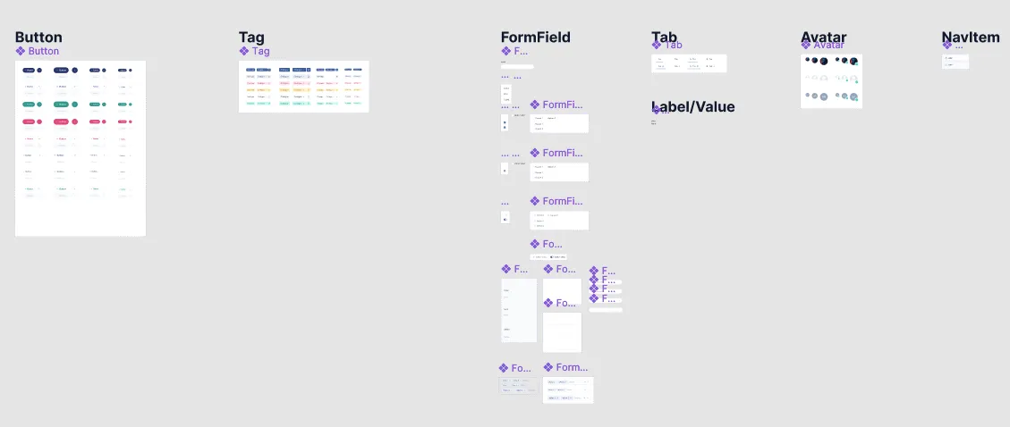
Lea English already had a clear and well-defined visual identity, which we naturally integrated into our custom design system. We built upon components from Start UI Figma, an open-source Figma library that we designed and use internally.
The components we use in Figma are already implemented in Start UI Native. This library uses technologies like TypeScript, React and Ficus UI. Thanks to this, developers can immediately accelerate the implementation phase after design finalization. Furthermore, it ensures consistency for future features to come.
UX Feature Analysis
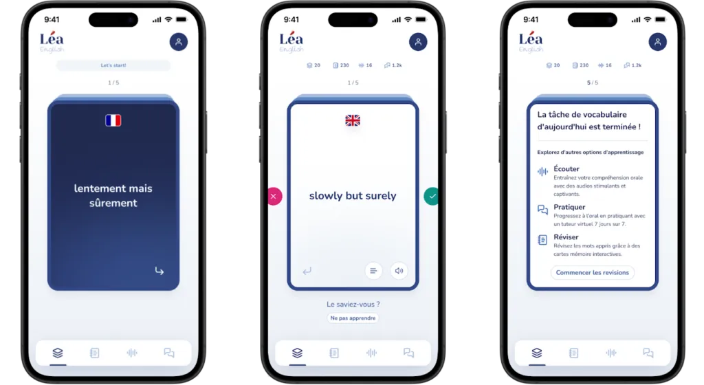
1. Daily Vocabulary Cards
-
Interactive Flip Cards
- Users interact via an intuitive flip gesture to reveal the translation, reinforcing active recall — a proven learning technique.
- The flip interaction immediately stimulates cognitive attention, promoting better retention.
-
Daily Limit
- Restricting to 5 cards per day manages cognitive load, prevents fatigue, and improves long-term retention.
- This introduces a gamification element, creating anticipation and establishing a daily routine.
-
Progress Indicator
- Clearly visible progress counters or bars encourage regular user engagement and provide immediate feedback on daily goals achieved.
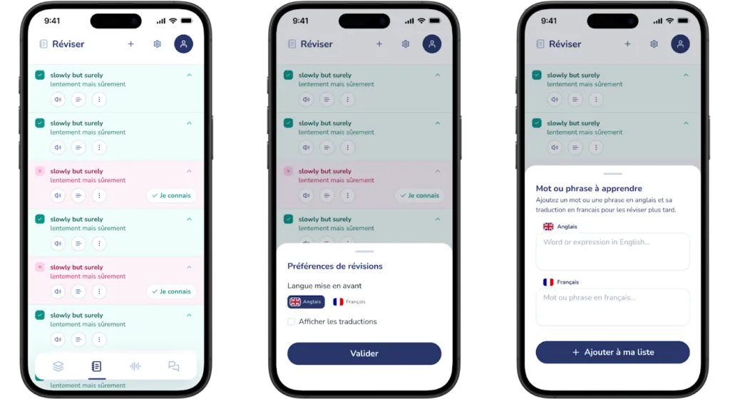
2. “Review” Feature
-
Synchronized Listing
- Words flipped in the daily cards automatically appear in the review section. These are clearly marked based on the user’s interaction (green for known, red for unknown).
- This synchronization ensures a seamless integration between learning and vocabulary review, reinforcing assimilation.
-
Personalized Vocabulary Management
- Users can manually add new words to customize their vocabulary list, enhancing the personalization of their learning experience.
- Options such as marking a word as “known” or removing it with “don’t learn anymore” allow for efficient management of words to practice.
-
Flexible Display Options
- Users can choose to display words in French or English first, according to their learning preferences.
-
Audio and Examples
- Users can listen to pronunciation directly in the review section, supporting auditory learning.
- Contextualized word or expression examples help reinforce understanding and correct usage.
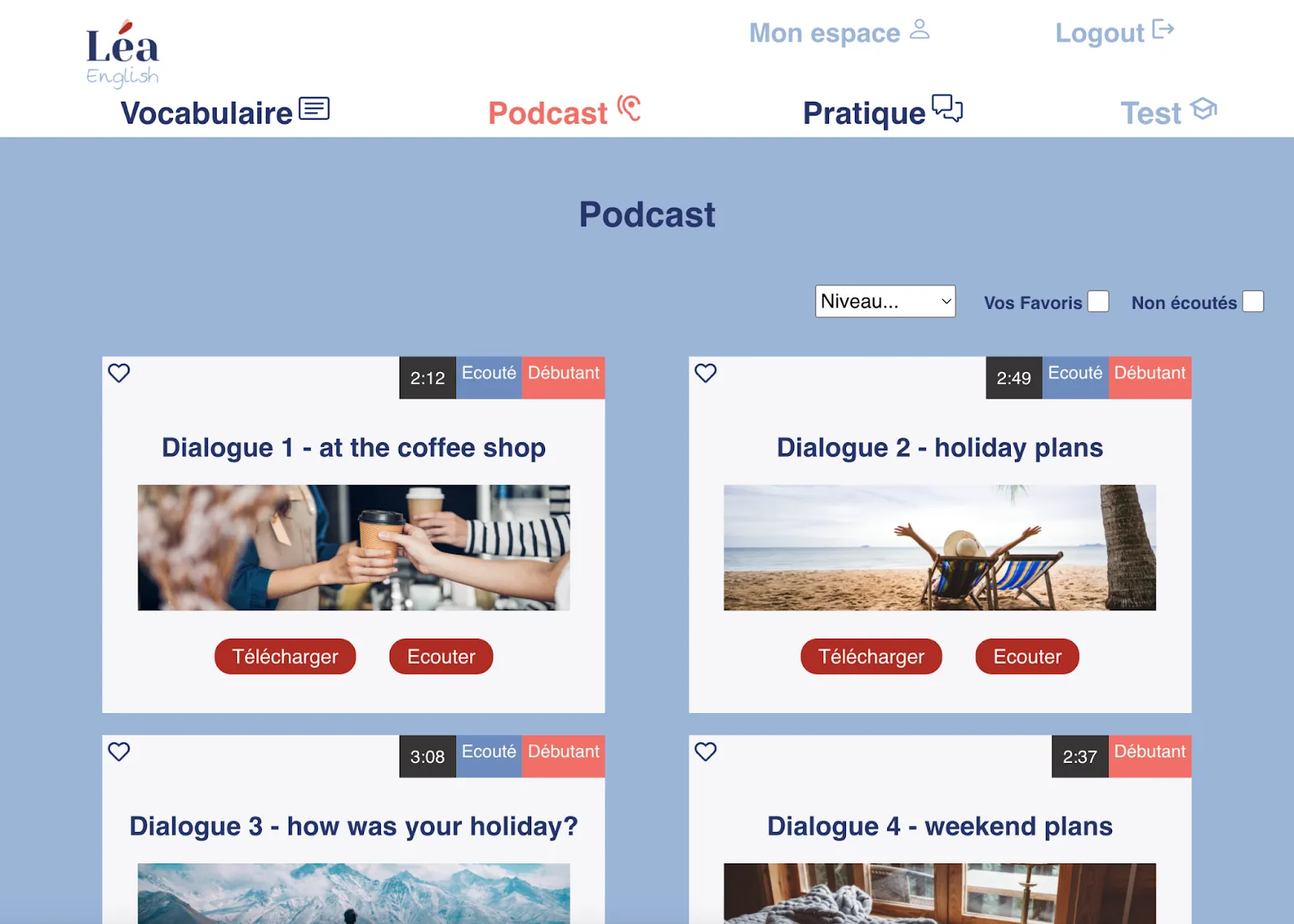
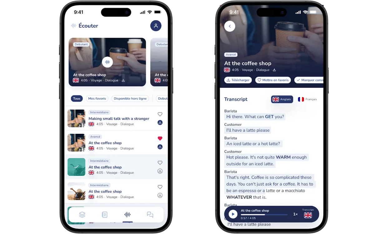
3. “Listen” Feature
-
Personalized Audio Recommendations
- Suggested audio content is highlighted at the top of the screen based on the user’s English level (beginner, intermediate, advanced), ensuring content relevance.
- Each audio is clearly labeled by language level, type (dialogue or monologue), and general theme, facilitating quick and informed selection.
-
Visual Progress Tracking
- Already-listened audio content is indicated in green, offering immediate visual feedback on the user’s progress.
-
Advanced Filtering
- Users can filter audio by favorites, offline downloads, and levels, enabling effective personalization of listening sessions.
-
Quick Access Features
- Quick download and favorite (heart) options are directly accessible from the audio list, simplifying interactions and improving usability.
-
Detailed Audio Screen
- Quick action buttons for downloading, adding to favorites, or marking as listened offer more practical usage.
- Interactive transcriptions allow instant switching between English and French, with synchronized text highlighting to accompany reading and listening.
- New vocabulary in transcriptions is highlighted in uppercase and bold to facilitate immediate recognition and learning.
-
Fixed Audio Control Bar
- Audio controls remain permanently visible during scrolling, with integrated options for adjusting playback speed and showing or hiding the transcription, thus improving user comfort and control.
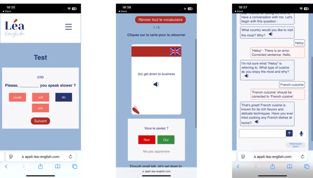
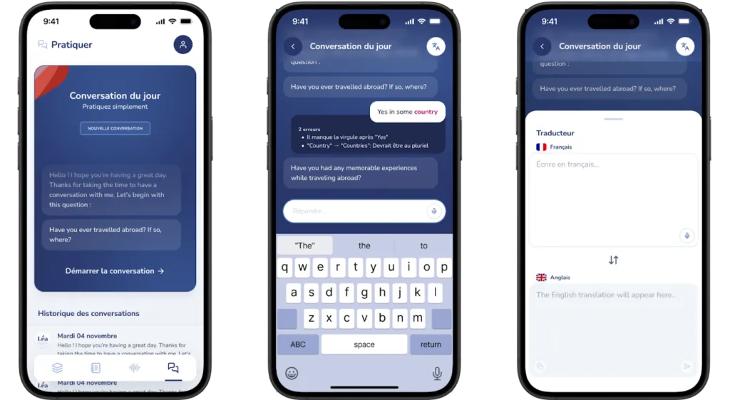
4. AI Conversation: “Practice”
-
Daily AI Conversation Sessions
- Users participate daily in guided AI conversations on predefined topics. This practice encourages active grammar use and conversational skill development.
- Real-time corrections provided by the AI offer immediate feedback, allowing users to quickly identify their mistakes and learn from them.
- The user has quick access to a translator during the conversation.
-
Error Highlighting
- Grammar or syntax errors are clearly flagged and corrected during exchanges, helping users internalize correct language structures.
-
Structured Daily Topics
- Varied daily themes ensure rich exposure to different vocabularies and grammatical contexts, keeping the exercise relevant and motivating.
Complete Launch Management and Visual Design
In preparation for the public release, we designed all the visual assets. This includes detailed app previews, optimized for different device formats on the App Store and Google Play. Additionally, we managed the entire launch process internally. We thus ensured consistent brand representation. Furthermore, we provided a smooth onboarding experience for users across all platforms.
Iterative Launch and Feature Integration
The initial release, in April 2025, strategically targeted approximately 300 users on launch day to create a controlled testing environment. This early feedback was invaluable, allowing us to iterate quickly and improve the user experience based on direct feedback.
Learning Pace Customization
Users requested a feature allowing them to choose the number of new cards to flip each day, in order to adapt their learning to their own pace.
Speech-to-Text Feature
Users also requested a speech recognition feature for AI-generated conversations, which was designed and successfully integrated.
Geographic Expansion
Community feedback revealed demand from other regions. We therefore expanded the app’s availability to several countries beyond France, including Morocco, the Democratic Republic of Congo, Canada, the United States, the United Kingdom, and Germany.
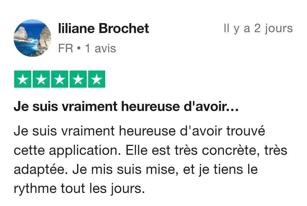
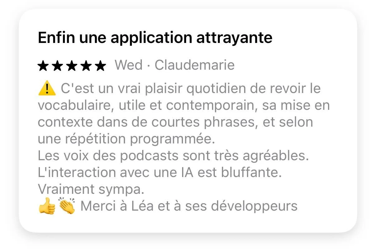
Launch feedback:
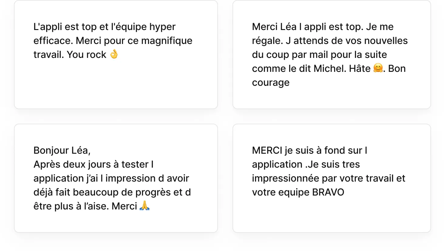
Post-Launch Results - First Month
The new mobile app saw strong user engagement in its first month. Over 2,000 installs across Android and iOS platforms.
Subscription Breakdown
-
Monthly subscriptions: approximately 60% of users opted for a monthly subscription, with the majority starting with a free trial.
-
Annual subscriptions: approximately 30% of users chose an annual plan, reflecting strong trust and lasting commitment.
-
Mid-term subscriptions (6 months): approximately 10% of users preferred this intermediate commitment.
Platform-Specific Insights
This subscription distribution pattern highlights the success of the onboarding and subscription strategy, indicating that the UX effectively communicated the product’s value and encouraged long-term engagement.
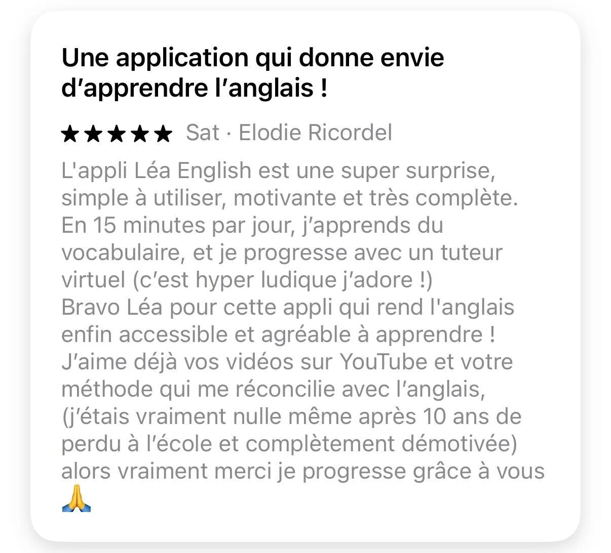
Reviews found on AppStore / Google Play / Trustpilot:


Final Thoughts
Based on the data collected, we believe we have successfully designed an effective application. It integrates principles of cognitive psychology. It also offers user-friendly and engaging UX interactions. By combining intuitive navigation with interactive learning elements, it delivers a personalized user experience. Thanks to this, our app fosters regular practice and lasting motivation. It also enables significant progress in English learning for French-speaking learners.
You can check out the interactive Figma prototype here → LINK